A colour palette is one of the handiest tools you can have in your brand arsenal. Colour communicates with an audience faster than imagery or words – and it does so across all language boundaries.
About colour palettes
While certain colours will have different meanings across cultures, many stay the same. Green and blue will always be soothing. Yellow is always warm and cheerful. Red is passionate and attention-grabbing.
But did you know that the wrong yellow can also communicate “cheap”? This is great if you’re a discount store but not so ideal if you’re trying to sell luxury products.
A colour palette created by a professional with knowledge of colour theory and best practices around colour is the easiest way to represent your brand accurately while avoiding the pitfalls of choosing the wrong colours (because not everyone has the time or $$$$ to take a design course).
The basic anatomy of a brand colour palette includes the following:
Main Colours
Accent Colours
Colour Codes
Each other these elements is important and will be used often in your branding. Let’s dive in and take a look at them.

Main Colours
Your Main colours are the colours that will be used for the most important elements of your brand, like your logo and website.
Any major supporting elements, like custom illustrations, should make heavy use of these colours. These main colours have been chosen because they stand out and convey what your brand is about, so you want them in as many places as possible. Because their purpose is to help people understand and remember you, simplicity is best. In general, you don’t need to have more than 4 main colours. In fact, 2 – 3 is ideal.

Accent Colours
Accent colours are your supporting colours. They’re there to take over when the Main colours might not be appropriate. Examples of this might be when you’ve already used your Main colours a lot and now need a hint of something else to break the design up and create some variety.
Other examples might be that your Main colours are too dark or heavy but your accent colours are lighter and work better as a light background. Accent colours are a great option to have on hand for when that limited Main palette isn’t quite what you need but you still need to maintain brand consistency.

Colour Codes
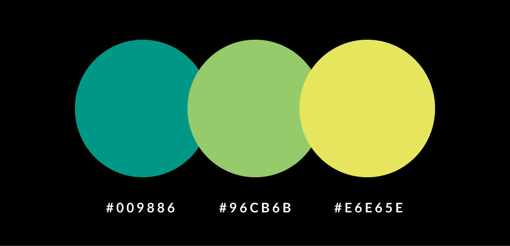
Some colour palettes will includes fancy names for each colour, like “Sea Spray” or “Aubergine”. These names are subjective though, so a more neutral system is typically used: hex codes.
A hex code is a series of six numbers and letters that is unique to that colour. Just changing even one character can completely change the colour, so it’s important to use the same hex code every time when choosing that yellow or red you want. Hex codes are extremely helpful because they’re so precise. Using them ensures you end up with the exact same shade of red every time, no matter what program you’re using. Being able to easily choose the same colour each time adds tremendously to your brand’s consistency, which in turn demonstrates reliability and professionalism. People pick up on this, even when they’re not consciously aware of it.

How to use Hex Codes
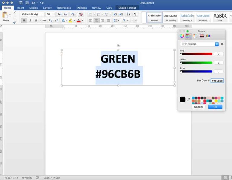
Using the above image as an example, open up your program of choice (I’m using Microsoft Word here because most people have Word and can try this too).
Type some text, then highlight it.
Go to the Colour Picker and select More Colours. It will show you a new window with a small white box inside. This is where you input the hex code for your desired colour. Type it in (or paste it from somewhere else).

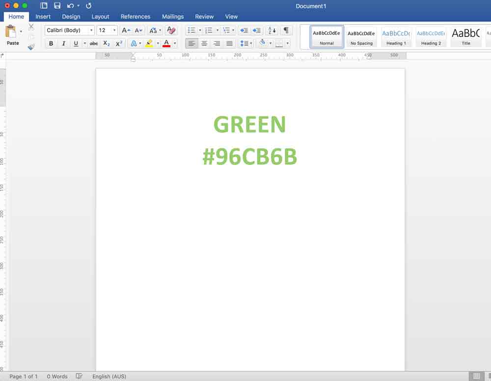
Press ‘ENTER’ and you’re done.

Your text should now be the exact colour you wanted it to be. And now you can do this in nearly any program that allows you to create written content or imagery.
Goodbye to using random colours and hello to brand consistency!
